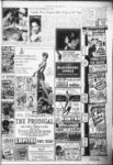
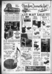
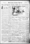
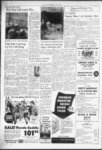
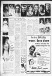
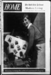
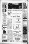
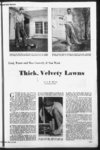
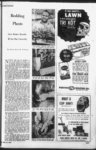
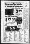
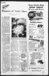
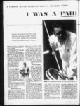
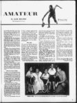
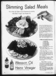
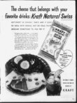
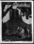
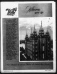
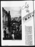
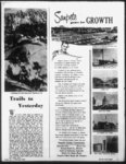
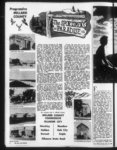
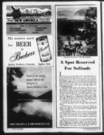
| Show ' KETCIIUHrS FOR THE BEST IN LIVING! karkecua er picnic In yeur knelt yard with tka protaction of on attractive I "joy PICNIC PORT Saa ar rain iholtor A pleasant autdeor ratrnat for family ' and geo tt s Sturdily constructed 4x4 pasts crossed kraced 2x4 plates 2x4 rafter reflective Hammered aluminum channeled drain raof READY ASSEMBLED d° $12500 for only OR BUILD to and IT YOURSELF (materials all pre-cu- t) ONLY $ncoo t I SPECIAL REDWOOD LAWN CHAIRS Aluminum— Ne Rest a In this dining mom designed by John B Wisner Fletlic-Ceat-- Cerd COUNTRY CIU1 PRIVACY IN YOUR RACK OWN YARO WITH RUSTIC RIAU-T- Y Of RIOWOOO folding selected for the walls to oet off the beauty of the mellow walnut furnishings a "light” color (yellow) was FENCING ed 95 ONLY 4-- ft 5 Sprinkling Systems Strike a Neutral Note i 5-- ft tem Height ft Height Q2tf Height $105 tie's Frtce per key a pucheged neat smdergreund gulvnn lied pipe sprinkling sys52-f- WEAVE BASKET If wip WW T Include end and upright pests — t I Ungtli f JUST Wnters apprex 700 s et 7th West 4th So ft when planning colors for a dining room Save Half tho Cost i CHAIN LINK ‘ k need to dwell on the point that the dining room or dining area is an im-Jportant part of home! Enjoyment of y good food Is a great American pastime —don’t let wrong colors detract one bit from itl Keep surrounding colors where you eat cool in type neutral in tone Choose for a -- jn j i $ i ' j O L basic color impression of soft grays neutral blues or soft well grayed greens Neutral “wood” tones are fine too within limits In-vestigate the new real wood wall coverings for say one wall of the dining area Accent colors in golds copper coral white or wine are fine but in limited amounts only Remember a dining area is usually small relatively It con- tains at least five separate items of furniture c usually an overhead light fixture— to say nothing of assorted adults and children at crucial hours Basic background color should not be Competing with these things nor detract from the more interesting colors in dinnerware silver clothing and last but certainly not least—the appetizing colors of foods themselves This thought brings us to further good argument for the basic nature of the colors suggested Eating is a warming process—literally Aside from the physical activity involved our whole body metabolism Is stepped up Nature goes into high gear to commence utilizing the food coming In— our body temperature processes are increased Cool surrounding colors subconsciously at work exert their influence to counteract this wanning activity— make eat ing more enjoyable WHY neutral tones In these colors? NOW good reason Everything we look at has as part of its color reflected color from something else nearby Food is no exception There is no doubt that our appetites are stimulated by what we know are the right colors in fresh fruits fresh or cooked vegetables meats and so on If dining area mass “colors are bright or intense their coldr is superimposed on these food colors often with dulling or unappetizing affect Take some ex treme examples— a bright coral wall your bric-a-bra- i ) f t t INSTALL IT YOURSELF By Don Blue© I undoy May 15 1955 - garden peas or broccoli will look dull Indeed (red plus green equals gray) A bright blue wall or ceiling can make butter look sickish green milk as if someone had swiped all the cream before you got It! Have you ever been repelled by the look of your butter and coffee in a restuarant where blue fluorescent lights glare down ? ’Nuff said! “How “deep” or “light" should dining colors be? Well let’s assume the dining table at least will have adequate lighting— this is so in most homes On this assumption go “light” if the furniture is of darker woods— “deep” as you like when table chairs and accessories are modern light toned woods It follows that prized furniture will be featured rather than camouflaged thereby with no serious change in proper function of wall and ceiling colors YES— the dining area of the smaller home the familiar short stem of the “L” room Well If right shaped dining-Uvin- g colors have been used in the living room the ceiling is a light grayed tone in the green or blue area Carry this (naturally!) through as the ceiling color of the dining area Now whether or not the “common” wall is broken by a divider of some kind the dining section of the wall can be distinct by the use of a wallpaper but it is not vital to do so Even a “warmish” living room color on this short section is fine But— treat the two shorter walls of the dining section as suggested If wallpaper is to be used avoid bright “jumpy” patterns or large bold designs Good decoration is just as easily achieved with textured papers simulated “weave” patterns and the like— and you still maintain correct color atmosphere together with good Integration with the living room color scheme Remember too this room or area Is one shared by the whole family Let all have a voice of approval in final choice Neutral colors rarely evoke strong personal prejudice associations— it won’t be hard to get unanimous approval Here again the right kind of colors okehed by all can make Mom’s good cooking taste even better! FENCING 34 MONTHS TO PAY NO DOWN PAYMINT RIQUIRtD Galvanized USE OUR FENCE STRETCHER AND EQUIPMENT FREE OF CHARGE Quality Since 1883 OPCN FRIDAY'S 'Til 900 PJ CRAGER WIRE & IRON WORKS OH 34 1 9th South Solt lake City Utah Phono 97 ferr Ming Gteffiiy aniiliflipf §mm CHANGE TO fovtmCAN-$tanda- td FITTINGS For bath shower kitchen or laundry Feature modem styling work-savi- ng advantages and Chromard finish oocopiete stock non-tarnishi- ng See our HEADQUARTERS OPtN SUNDAYS— 10 TO TO 4 ENGLAND PLUrlBIFIG CO 32 Highland Dr s -- I : t- i 3371 HI! i t |